WHAT IS BRANDING?
18 July


SIGN UP TO OUR MAILING LIST
It’s probably useful, when discussing branding, to kick off with an explanation as to what we mean by branding (as it means all things to all people!).
Many equate branding with a logo. It’s so much more than that – a logo is part of a brand, but so is tone of voice, look and feel of your website, printed collateral – basically everything that says who you are and what you stand for as a company.
The American Marketing Association (AMA) defines a brand as a “name, term, sign, symbol or design, or a combination of them intended to identify the goods and services of one seller or group of sellers and to differentiate them from those of other sellers”.
In essence, it’s any part of your company that your customers and potential customers can relate to, can pass on to friends, and can use to identify you (or their preferred brand) when placed alongside competitors. It also acts as the face of the company and is far easier to remember than a name.
THE GOOD
When he saw the Nike Swoosh, company co-founder Phil Knight famously said ‘I don’t love it, but I think it will grow on me’. I think it’s fair to say it grew on most people! Incidentally – and this is for those of you who don’t know this well-worn story – the logo was created by design student Carolyn Davidson for just $35. Even taking into account the diamond ring and $600,000-worth of shares she was later given, this mark is great value.
Compare that cost to the $211 million that BP spent on a rebrand in 2001, the $100 million spent by Accenture, or event the $1.8m and $1m spent by BBC and Pepsi respectively to see how lightly they got off!
That said, Google and Coca Cola got away with paying nothing, while Twitter paid $6, so maybe Nike did pay a lot, after all!
THE BAD
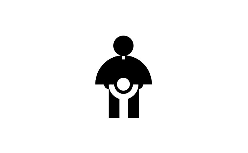
There are, of course, examples of companies who didn’t quite think things through. Shockingly, the logo for the Catholic Church’s Youth Commission shown here actually won an award despite… well, despite the obvious!
THE UGLY?
Finally, the London 2012 logo. Panned when it came out – one website even had more than 11,000 comments from readers saying they hated it. Not just disliked, hated! Bit harsh, especially when it looked good when used across all the signage, merchandise and so on associated with the Games.
This is a clear example where a) a brand was ahead of its time, and b) a brand can’t be judged on a logo alone, but on its execution as a whole.
There are also examples of companies who got their branding just right before making disastrous alterations – when Gap changed their look, they ended up looking like an accountancy firm rather than a clothes shop, which is probably not what they had in mind!
WHAT SHOULD I BE DOING?
So what’s in a good brand, and how do you achieve one? We did find an image that shows, in an ideal world, everything you’d consider during the branding process. But in an ironic twist given the advice was emphasising ‘clarity’, the image itself was just a confusing array of lines and bubbles! It’s probably easier to say a brand should:
-
- – Deliver your message clearly
- – Confirm your credibility
- – Connect your target prospects emotionally
- – Motivate the buyer
- – Concrete User Loyalty
- – Achieve staff buy-in – without their approval, you’re fighting an uphill battle
A brand is a living thing that consists of many components that must all integrate into a seamless, functional whole, with your brand strategies running through every point of public contact.
There are certain things we can influence when coming up with a brand, and others we can’t, but here are things we try to think about:
– Is it simple? A brand demands a logo is used on everything from business cards to billboard posters. That’s why we ensure logos look as good as a thumbnail a they do when used large
– Have we been consistent? There’s nothing worse than getting a business card, going to check out the company website and wondering if you’ve come to the wrong place as the two bear no resemblance to each other. Or finding a company online, ordering a brochure, and receiving something through the post that may as well be from another company. Your brand is about looking professional and trustworthy, so your customers need to know they’re at the right place
– Have we told the company story? Your logo should be a visual expression of the story you want to tell, and your brand needs to follow that story through
WHAT CAN POSSIBLY GO WRONG?
– You only change the logo. As we’ve seen, a brand is more than a logo, it’s your entire identity. But if you change a logo without altering the brand story, you’re not improving anything and risk creating a conflict between your brand and new logo
– You expect others to think like you. Customers can’t read your mind, so bear in mind that the company name or strapline that you think is ingenious may not be understood by your target audience, leaving them confused and you out of pocket
– Not identifying what the product / service is and showing why your customers would want it Clairol did a ‘Look of Buttermilk’ and ‘Touch of Yoghurt’ range – are you putting dessert in your hair? I did that once, and it didn’t turn out too well!
– Lending your name to an unrelated product – Harley Davidson merchandise usually sells well, but not so much when they put their name to aftershave / perfumes
SIGN UP TO OUR MAILING LIST


